


The colour of a display frame can change the overall look of a collection more than many people expect.
Whether you are displaying trading cards, graded slabs, sports memorabilia or other collector pieces, the frame finish helps determine how the display sits within the room and how strongly the outer frame stands out.
Some collectors prefer a neutral frame that lets the cards provide most of the colour, while others choose a stronger metallic or warm-toned finish that becomes a more noticeable part of the display.
There is no single best option. The right frame colour depends on the collection, the wall behind it and the overall look you want to create.
Why Frame Colour Matters
Frame colour affects how clearly the display stands out from the wall and how the cards sit within the overall presentation.
The right colour can:
- Highlight featured cards.
- Work with existing room colours.
- Create a more modern or traditional appearance.
- Complement collection themes.
- Give several displays a consistent look.
It is a relatively simple design choice, but it can have a noticeable effect once the frame is mounted on the wall.
Black Display Frames
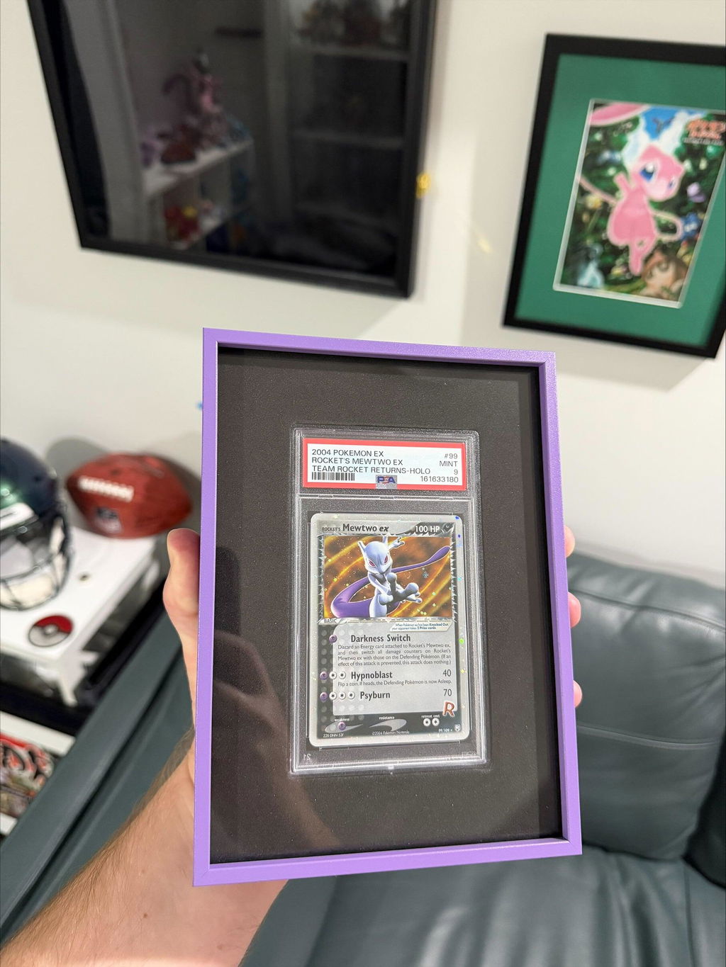
Black is one of the easiest frame colours to use across different types of collections.
Its neutral appearance works well with colourful cards and mixed collections because it does not need to match any one colour within the artwork.
Black is commonly used for:
- Pokémon cards.
- Sports cards.
- Graded slabs.
- Collector walls.
Against lighter walls, black creates a strong outline. Against darker walls, it can become more understated.
Silver Display Frames
Silver provides a lighter neutral option and keeps the metallic character of the frame visible.
It works well in modern rooms, gaming spaces and offices, particularly when the surrounding furniture or shelving already uses grey or metallic finishes.
Silver can also be useful for mixed collections because it does not strongly favour any particular card colour or grading label.
Gold Display Frames
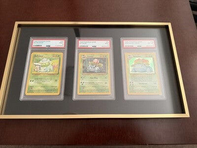
Gold introduces a warmer tone and gives the outer frame more visual presence than black or silver.
It can work particularly well with cards that already contain yellow, gold, brown or other warm colours, but it does not need to match the collection directly.
Gold can also create strong contrast against darker walls while remaining clearly visible on lighter neutral backgrounds.
Copper Display Frames
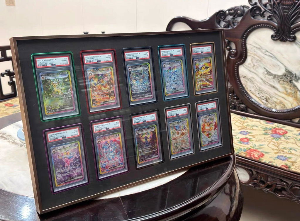
Copper sits between brown, orange and metallic tones, giving it a warmer appearance than silver without being as bright as gold.
It can work well in rooms with timber furniture, beige or cream walls and other warm finishes.
Copper can also suit collections containing orange, red, brown or other earthy colours while still providing enough contrast to remain distinct from the cards.
Matching Your Collection
There are several ways to approach frame colour.
Some collectors choose a finish that relates directly to the cards, while others base the decision more heavily on the wall or surrounding room.
Things to consider include:
- Card colours.
- Room décor.
- Wall colour.
- Lighting.
- Other frames in the room.
- Personal preference.
There is no universally correct choice. A neutral finish may work best for one collection, while a stronger metallic colour may suit another.
Creating a Cohesive Display
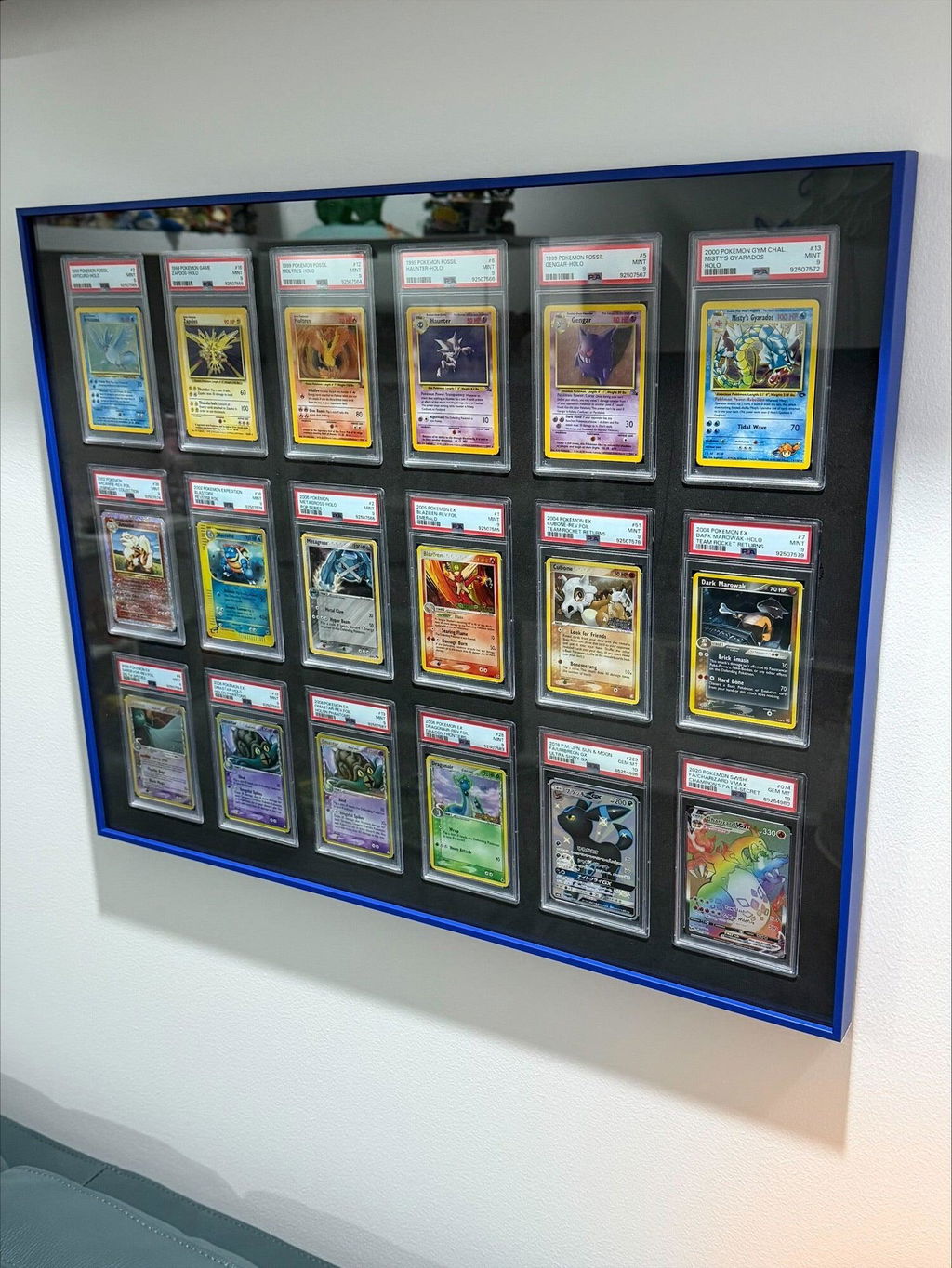
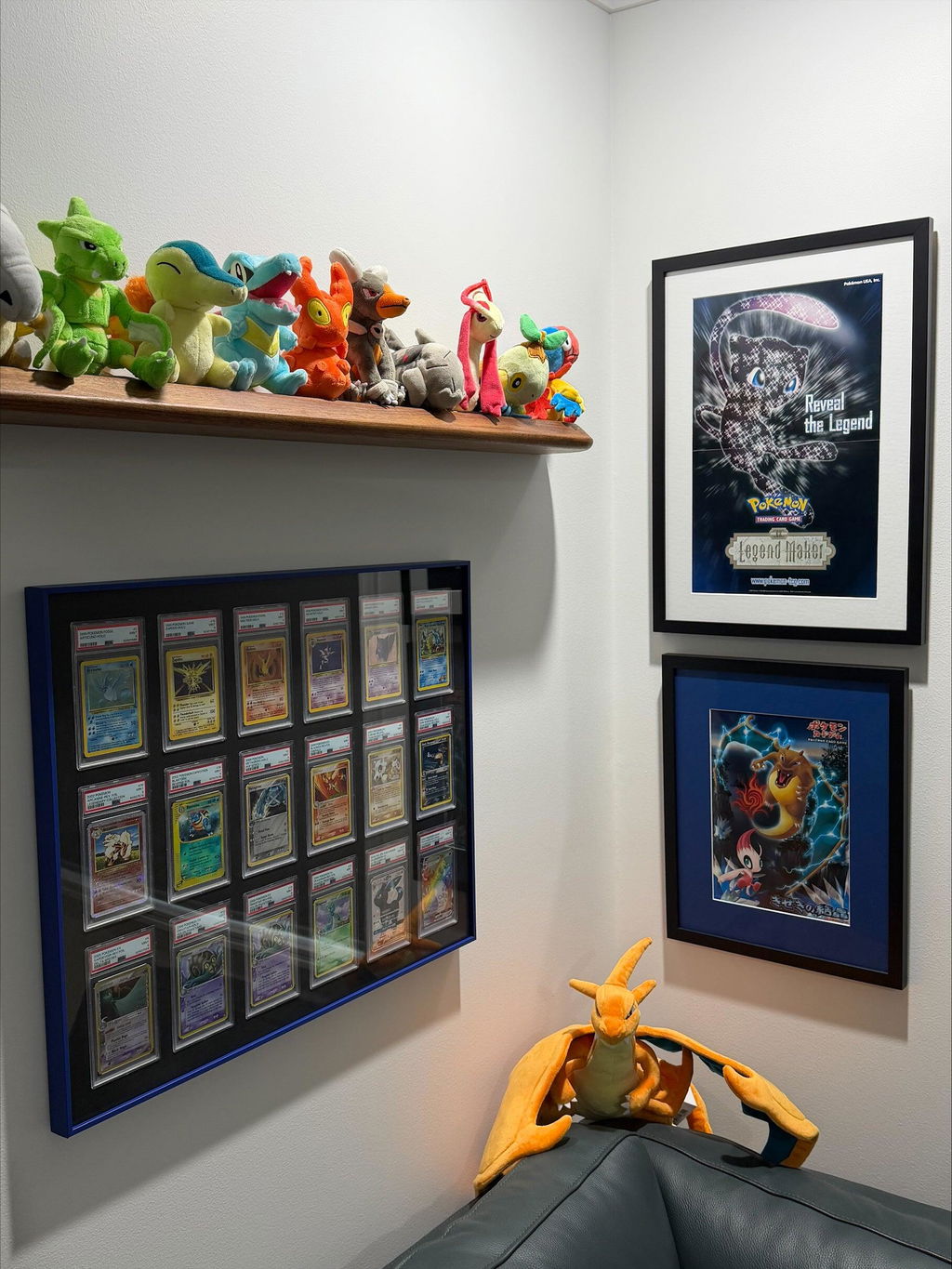
If several frames will be displayed together, keeping the outer finish consistent can help the wall feel more organised.
Using the same frame colour across multiple displays allows the cards themselves to provide most of the variation while the frames create a common visual structure.
That said, different frame colours can also be used deliberately to separate individual collections, teams or themes.
Final Thoughts
Frame colour is one of the simplest ways to change the appearance of a trading card or memorabilia display.
Black and silver provide versatile neutral options, while gold and copper introduce warmer tones and a more noticeable outer frame.
The best choice is the one that works with the cards, the wall and the room as a whole rather than trying to match one element in isolation.
Continue Exploring
If you enjoyed this guide, you may also find these collector resources helpful.
📚 Collector Guides
-
The Ultimate Trading Card Display Guide: Ideas, Frames, Shelves & Display Solutions for Every Collector
Explore display ideas, wall layouts, shelving, cabinets, lighting, budgets and display solutions for every major trading card game. -
Why Premium Aluminium Trading Card Display Frames Are Worth It: The Complete Collector Guide
Discover why handmade aluminium display frames have become a premium choice for displaying PSA, CGC, BGS and One Touch trading card collections.
🛒 Shop Display Collections
-
Aluminium Trading Card Wall Display Frames
Premium handmade aluminium wall display frames for Pokémon, MTG, Yu-Gi-Oh!, One Piece and Sports Cards. -
PSA, CGC & BGS Graded Slab Wall Display Frames
Purpose-built wall display frames designed specifically for graded trading card collections. -
One Touch Wall Display Frames
Premium wall display frames designed for One Touch magnetic trading card holders in a range of grid sizes.

0 comments