


Trading cards are already highly visual, but the colour of the frame around them can change the overall look of the display more than you might expect.
A black frame creates a neutral border around colourful artwork, while silver and grey offer a lighter metallic look. Gold introduces a warmer tone, and colours such as red, purple and orange allow the frame itself to become a more noticeable part of the overall colour scheme.
There is no single best colour for a trading card display frame. The right choice depends on the cards, the wall behind them, the surrounding room and whether you want the frame to blend in or create a stronger contrast.
This guide looks at different aluminium frame colours and how they can work with Pokémon, Magic: The Gathering (MTG), Yu-Gi-Oh!, One Piece and sports card collections, including cards displayed in PSA, CGC, BGS and One Touch holders.
Choosing a Colour for Your Trading Card Display Frame
Before choosing a frame colour, it helps to look at the display as a whole rather than judging the frame on its own.
The same colour can look completely different depending on what surrounds it. A dark frame against a charcoal wall may feel quite subtle, while the same frame against a white wall creates a much more defined outline. Stronger colours such as red, purple and orange create a different effect again.
There are three straightforward ways to narrow down the choice:
- Keep it neutral: choose black, silver, grey or another relatively neutral colour and let the cards provide most of the colour.
- Complement the collection: choose a frame with colours or tones that already appear throughout the cards.
- Create contrast: choose a frame colour that deliberately differs from the wall or the cards to create a more defined boundary around the display.
None of these approaches is automatically better. The main question is how much of a visual role you want the outer frame to play.
Black Trading Card Display Frames
Black is one of the most versatile frame colours because it does not strongly favour any particular colour within the cards.
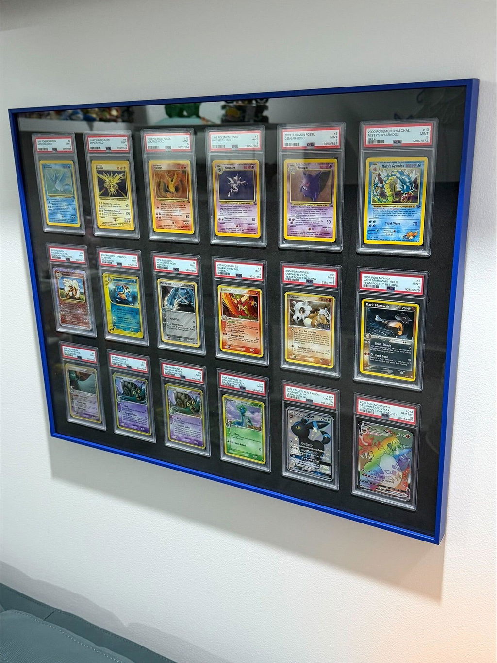
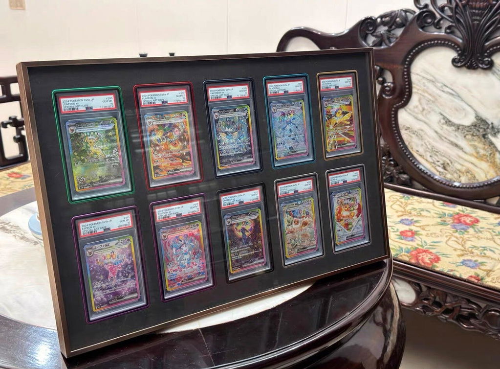
Our Matte Black finish can work especially well with mixed collections containing many different card designs. A Pokémon collection, for example, can include bright yellow, red, blue, green, purple and metallic artwork. A black outer frame gives all of those colours one consistent boundary without trying to match any single card.
Against white, cream or light grey walls, black creates strong contrast and makes the overall shape of the display easy to see. Against charcoal or darker walls, the frame becomes more subdued, allowing the cards and internal layout to attract more attention.
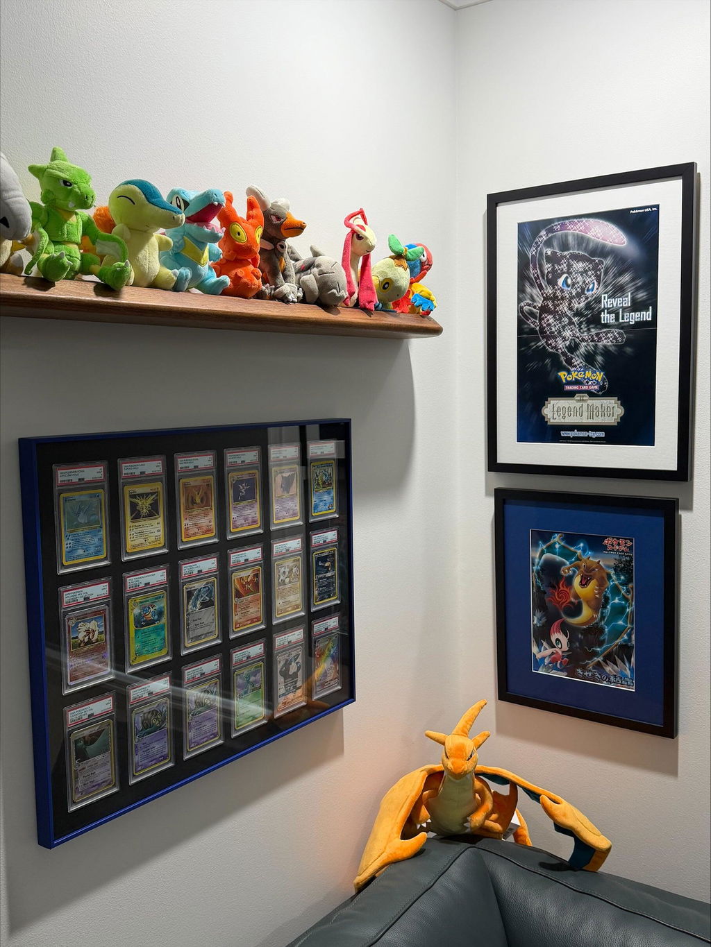
Black is also useful when several trading card displays are installed together. Using the same neutral frame colour across Pokémon, MTG, Yu-Gi-Oh!, One Piece and sports card collections can visually connect displays that otherwise contain very different artwork.
Silver Trading Card Display Frames
Silver provides a lighter neutral alternative to black while keeping the metallic character of an aluminium frame.
Because silver works comfortably alongside a wide range of colours, it can suit both highly colourful trading card collections and more restrained graded-card displays.
On dark grey, charcoal, navy or black walls, silver creates a clear lighter outline. On white and pale walls, the contrast is softer, creating a more subtle transition between the wall and the frame.
Silver also works easily with PSA, CGC and BGS slabs because it does not need to coordinate with a particular grading label or card design. That makes it useful for collections containing cards from different sets, years, teams or trading card games.
In collector rooms with metal shelving, grey furniture or other neutral finishes, silver can also help keep the room visually consistent without requiring the cards themselves to follow the same colour theme.
Titanium and Grey Trading Card Display Frames
Titanium offers a darker grey option for collectors who want something between traditional silver and black.
Grey is useful because it remains neutral while creating a different relationship with the wall. Against white, off-white or pale grey, a titanium-coloured frame is still clearly visible without producing the same level of dark contrast as black.
Against concrete-style, medium grey or darker walls, titanium can become much more understated. This can work particularly well when you want the card artwork to provide most of the colour in the display.
Grey tones are also easy to use with collections that do not have one dominant colour. A mixed Pokémon collection, MTG cards across several colour identities, or sports cards from multiple teams can all sit inside the same neutral outer frame without one part of the collection dictating the frame colour.
Gold Trading Card Display Frames
Gold is a warmer option and creates a noticeably different look from black, silver or grey.
Against black, charcoal, dark green, navy and other deeper wall colours, gold produces strong colour contrast. Against white, cream and lighter neutral walls, the overall combination becomes lighter while the gold frame still remains clearly visible.
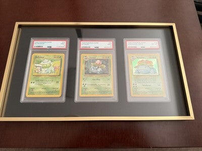
Gold can work particularly well when similar warm colours already appear throughout the collection. Classic yellow-bordered Pokémon cards are an obvious example, along with cards containing gold foiling, yellow artwork, brown tones or other warm details.
It can also work independently of the card colours. A mixed collection containing many unrelated colours can still use gold as a consistent outer border rather than trying to match individual cards.
For sports cards, gold can work naturally when gold, yellow or related tones form part of a team identity. The same principle applies to Pokémon, MTG, Yu-Gi-Oh! and One Piece collections where warmer colours appear repeatedly throughout the artwork.
Bronze and Copper Trading Card Display Frames
Bronze and copper sit in a warmer part of the colour spectrum, combining brown, orange and metallic tones rather than the brighter yellow character of gold.
Our Bronze colour can therefore provide a useful middle ground for collectors who want a warm frame without moving into gold, red or orange.
Bronze and copper-coloured frames can work especially well against cream, beige, off-white, charcoal and darker neutral walls. They also pair naturally with rooms containing timber furniture or other warm brown tones.
Within the collection itself, bronze can complement cards containing brown, orange, red, yellow and other earthy or warm colours. Older card artwork and vintage-inspired collections can also suit this type of palette.
With bronze, it is particularly useful to consider both the wall and the cards. In a warmer interior, the frame can become part of the existing colour scheme. Against cooler grey surroundings, it creates a more obvious contrast.
Cherry Red Trading Card Display Frames
Red is a much stronger colour choice than black, silver or grey, so it naturally makes the outer frame a more noticeable part of the display.
Our Cherry colour provides a deeper red option that can either coordinate with colours already present in a collection or create deliberate contrast.
Against white, cream and light grey walls, red creates a clearly defined outline around the cards. Against black, charcoal and other dark backgrounds, the overall contrast changes while the red frame remains visually distinct.
Red also appears frequently in trading card artwork. Fire-type Pokémon collections are an obvious example, while Magic: The Gathering has an entire red colour identity. Sports collectors may instead choose red because it appears in a favourite team's colours.
The frame does not need to match the cards. Red can also create strong contrast with collections dominated by blue, grey or other cooler colours, so it works both as a complementary colour and as a deliberately contrasting one.
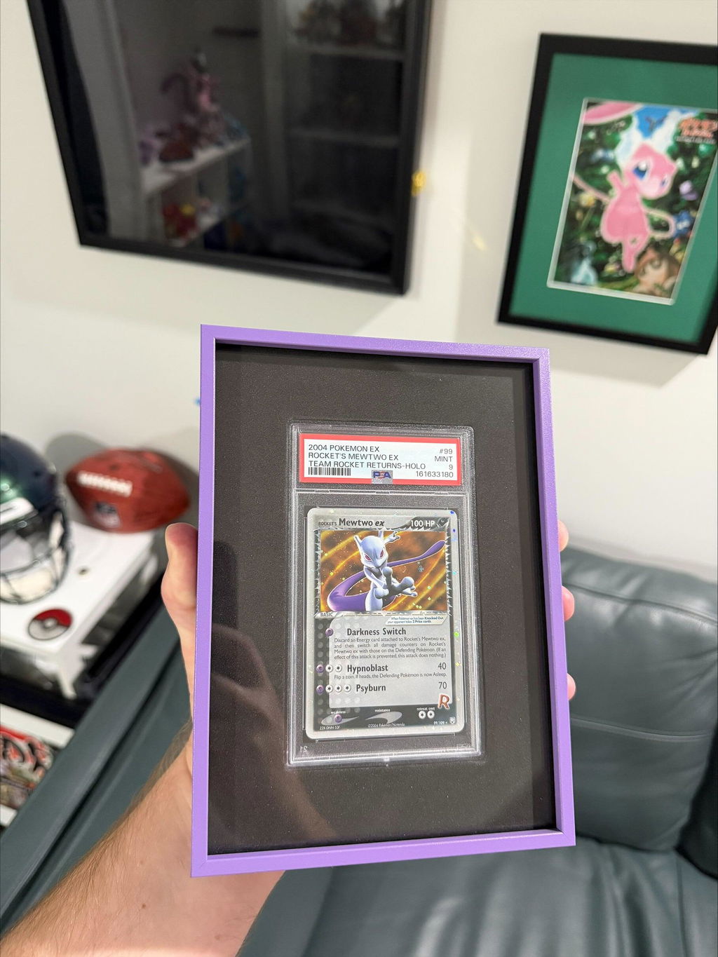
Violet and Purple Trading Card Display Frames
Violet brings a recognisable purple tone into the display and behaves very differently from neutral black, silver and grey.
Against white and pale neutral walls, purple creates clear colour separation. On dark grey or black walls, the surrounding colour is deeper, which reduces the overall contrast while still keeping the violet frame visible.
Purple is particularly relevant to trading cards because it appears frequently in the artwork. Pokémon collections based around Psychic or Ghost types can contain strong purple, pink and blue tones, while MTG, Yu-Gi-Oh! and other games also use violet and purple extensively.
Violet can also create deliberate contrast against yellow and gold cards. Matching and contrasting do not need to be treated as opposites; one display can contain elements of both depending on the individual cards.
Tangerine and Orange Trading Card Display Frames
Orange is another strong frame colour, sitting firmly within the warmer red, orange and yellow part of the spectrum.
Our Tangerine colour can create a clearly visible boundary against white, pale grey and concrete-style walls. Against charcoal, dark grey or black, the orange remains distinct while interacting with a much darker surrounding colour.
Orange works naturally with cards containing warm artwork, including combinations of orange, red, yellow and brown. Fire-themed Pokémon collections are one example, but the same idea can apply to sports cards using orange team colours or other trading card collections with repeated warm tones.
It can also be used for contrast. Orange and blue create a particularly strong visual difference, so a collection with a lot of blue can look very different inside an orange frame compared with the same cards inside black or silver.
Because orange is more noticeable than a neutral frame colour, it is worth considering the surrounding room as well as the cards before choosing it for a particularly large display.
Matching Your Trading Card Frame to the Wall
The wall behind the frame can influence the finished display almost as much as the cards themselves.
White and Light-Coloured Walls
Light walls create a relatively neutral background and make darker or stronger frame colours easy to distinguish. Black, titanium, red, violet and orange all create obvious separation, while silver and other lighter colours generally produce a softer transition.
Grey and Concrete-Style Walls
Grey surroundings work with almost every frame colour, but they can change the amount of contrast considerably. Titanium and silver can remain relatively restrained, while gold, bronze, red, violet and orange introduce warmer or stronger colour against the neutral background.
Dark Walls
Black and charcoal walls can make darker frames less visually dominant. Lighter and stronger colours such as silver, gold, orange or red provide greater separation when you want the outline of the frame to remain clearly visible.
Rooms With Timber and Warm Colours
Rooms containing timber furniture, beige walls and other warm materials can work naturally with gold, bronze, copper and other warm-toned frame colours. Black and grey can instead introduce a cooler neutral contrast against those surroundings.
Matching Frame Colours to Pokémon, MTG and Other Trading Cards
The amount of colour variation across trading card games means there is rarely one frame colour that works for every collection.
Pokémon Card Display Frames
Pokémon cards cover an enormous range of colours, so both neutral and collection-specific approaches can work well.
Black, silver and titanium are useful for mixed Pokémon collections because they do not require the cards to share a dominant colour. More focused collections can use the frame colour as part of the overall theme.
A Fire-type collection may contain enough red and orange artwork to work naturally with Cherry or Tangerine, while Psychic and Ghost-type collections often contain purple tones that can coordinate with Violet. Classic yellow-bordered Pokémon cards can also sit naturally alongside warmer gold finishes.
These are design examples rather than rules. Contrasting the frame with the cards can work just as well as matching them.
Magic: The Gathering (MTG) Display Frames
Colour plays an unusually important role in Magic: The Gathering, which makes MTG collections particularly interesting when choosing a frame.
Collectors may build displays around a particular MTG colour identity, set, artist, deck or group of favourite cards. A red-focused Magic collection, for example, can use a red frame to continue the colour theme or a darker neutral frame to separate the artwork from its surroundings.
For MTG displays containing several colour identities, black, silver and titanium offer neutral options that do not favour one colour over another.
Yu-Gi-Oh! Card Display Frames
Yu-Gi-Oh! artwork regularly combines dark colours with gold, purple, blue, red and other strong tones.
A neutral black or titanium frame can keep those differences inside the cards, while gold, violet and other coloured frames can be used when similar colours appear repeatedly across a themed Yu-Gi-Oh! collection.
One Piece Card Display Frames
One Piece Card Game artwork can be extremely colourful, so collectors have plenty of freedom when choosing the surrounding frame.
Black, silver and grey create a consistent outer boundary around cards containing many different colours. Alternatively, a stronger frame colour can be chosen around a particular character, card group or colour theme.
Sports Card Display Frames
Sports card collections give collectors another practical reason to think about colour because many collections are already organised around a particular club, team or player.
A red, orange, purple, gold or other coloured frame can relate to colours already used by a team, while black, silver and grey remain easy choices when a collection spans several teams or sports.
The same approach can be used across basketball, football, soccer, baseball and other sports card collections without requiring every individual card to use exactly the same colours.
Should the Frame Match or Contrast With the Cards?
Matching is only one way to choose a trading card frame colour.
A frame that shares colours with the cards can create a more coordinated display. A contrasting frame creates clearer separation between the collection and its surroundings.
For example, blue cards inside an orange frame create strong colour contrast, while orange and red cards inside the same frame create a warmer and more closely related palette.
Neutral colours offer a third option. Black, silver and grey can sit around almost any artwork without requiring either a close colour match or deliberate contrast.
Why Aluminium Works Well for Coloured Trading Card Frames
One reason aluminium works particularly well for trading card display frames is the range of colours that can be incorporated into the frame itself.
Rather than treating the outer frame purely as a border, collectors can choose a colour that works with the cards, the wall and the surrounding room.
The CardVault® aluminium display range from The Card Collective® combines a slim aluminium frame profile with precision-cut holder inserts and clear acrylic fronts, allowing the cards to remain the main focus of the display.
Our aluminium frames are made in-house using quality components sourced from trusted suppliers and are available across multiple display layouts, holder configurations and colour options.
Available colours and configurations can vary between products and sizes, so the options shown on each individual product listing should always be checked when planning a specific display.
PSA, CGC, BGS and One Touch Display Frames
Frame colour is only one part of configuring a trading card display. The holder surrounding each card also determines the internal layout required.
Our aluminium range includes display options designed around major holder formats including PSA, CGC, BGS and One Touch.
SlabVault® displays are designed for graded trading card collections, while MagVault® displays are designed for trading cards protected in One Touch magnetic holders. Both sit within our broader CardVault® display range.
This allows collectors to consider holder type, card count and frame colour as separate decisions when planning the finished display.
Choosing Colours for Large Trading Card Displays
Frame colour becomes more noticeable as the physical size of the display increases.
A small frame occupies relatively little wall space, while a large multi-card display creates a much larger outline within the room. For larger collections, it is worth considering how the chosen colour works with the entire wall rather than judging it only from a small sample.
Neutral colours can make it easier to display a large number of cards containing unrelated artwork, while stronger colours can work well when the collection or the room already follows a particular colour scheme.
Collectors building several displays on the same wall can also choose between keeping every frame consistent or using different colours to separate individual collections.
Frequently Asked Questions
What is the best colour for a Pokémon card display frame?
There is no single best colour for a Pokémon card display frame. Black, silver and grey are versatile choices for mixed collections, while red, orange, purple, gold and other colours can complement or contrast with specific Pokémon, card types and artwork. The wall colour should also be considered.
What colour frame works best with MTG cards?
Magic: The Gathering collections can use neutral colours such as black, silver and grey or a colour related to the collection's MTG colour identity. For mixed Magic: The Gathering displays, a neutral frame can make it easier to accommodate cards containing many different colours.
Should a trading card frame match the cards or the wall?
Both are worth considering. Matching the cards can create a coordinated colour scheme, while choosing a frame that contrasts with the wall can make the overall shape of the display more distinct. In many cases, a neutral frame provides an effective middle ground.
Are black trading card display frames the most versatile?
Black is one of the most versatile choices because it works with a wide range of card artwork and room colours. Silver and grey can provide similarly flexible alternatives when a lighter frame is preferred.
What colour frame works with PSA, CGC and BGS graded cards?
PSA, CGC and BGS graded cards can work with almost any frame colour. Neutral black, silver and grey frames are useful for graded collections containing different labels and card designs, while stronger colours can be chosen around the cards, team, set or surrounding room.
Can coloured frames be used for sports card displays?
Yes. Sports card collectors can choose colours that complement team colours or use neutral black, silver and grey frames for collections containing several teams. Basketball, football, soccer, baseball and other sports card collections can all use the same basic approach.
Do One Touch trading card display frames come in different colours?
Our MagVault® aluminium displays for One Touch magnetic holders are available with multiple colour options depending on the selected product and configuration. Current availability should always be checked on the individual product page.
Should large trading card display frames use neutral colours?
Not necessarily. Neutral colours can make large displays easier to coordinate with rooms containing many different card colours, but stronger colours can work just as well when they suit the wall, collection or surrounding décor. The larger the frame, the more useful it is to consider the complete wall before choosing the colour.
Final Thoughts
There is no universal colour that works for every trading card display.
Black, silver and grey are versatile options for collections containing many different colours, while gold, bronze, red, violet, orange and other finishes allow the frame to play a more deliberate role in the overall colour scheme.
The most useful approach is to consider the cards, wall and surrounding room together. A frame colour that looks subtle against one wall can create much stronger contrast against another.
The same principle applies whether you are displaying Pokémon cards, Magic: The Gathering (MTG), Yu-Gi-Oh!, One Piece, sports cards or a mixed trading card collection.
With aluminium trading card displays available across different colours, sizes and holder configurations, collectors can choose a combination that suits both the collection and the space where it will actually be displayed.
Continue Exploring
If you enjoyed this guide, you may also find these collector resources helpful.
📚 Collector Guides
-
The Ultimate Trading Card Display Guide: Ideas, Frames, Shelves & Display Solutions for Every Collector
Explore display ideas, wall layouts, shelving, cabinets, lighting, budgets and display solutions for every major trading card game. -
Why Premium Aluminium Trading Card Display Frames Are Worth It: The Complete Collector Guide
Discover why handmade aluminium display frames are a premium option for displaying PSA, CGC, BGS and One Touch trading card collections.
🛒 Shop Display Collections
-
CardVault® Aluminium Trading Card Wall Display Frames
Explore aluminium trading card wall display frames in multiple colours, layouts and holder configurations for Pokémon, MTG, Yu-Gi-Oh!, One Piece and sports cards. -
SlabVault® PSA, CGC & BGS Graded Slab Wall Display Frames
Purpose-built wall display frames for graded trading card collections across a range of display sizes. -
MagVault® One Touch Wall Display Frames
Aluminium wall display frames designed for trading cards protected in One Touch magnetic holders.

0 comments