


When planning a trading card or memorabilia display, most people naturally focus on the items being shown. The colour surrounding those items can still make a noticeable difference to the finished presentation.
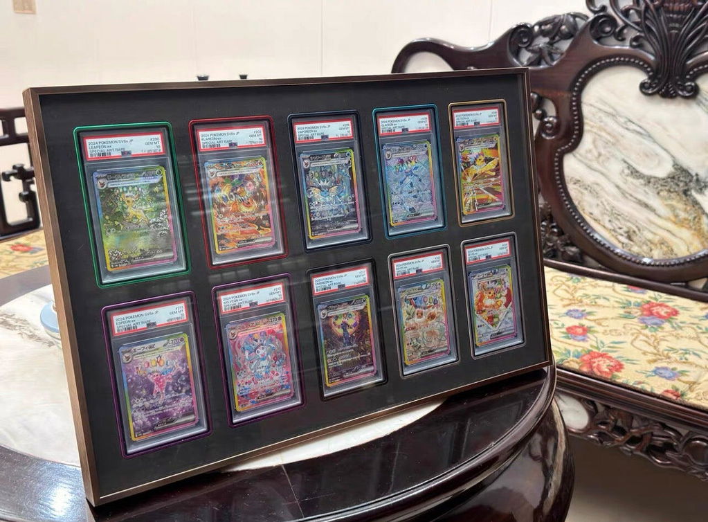
In purpose-built trading card displays, that surrounding field may come from an EVA foam insert rather than traditional matboard. The basic design principle is the same: the background should support the collection without competing with it.
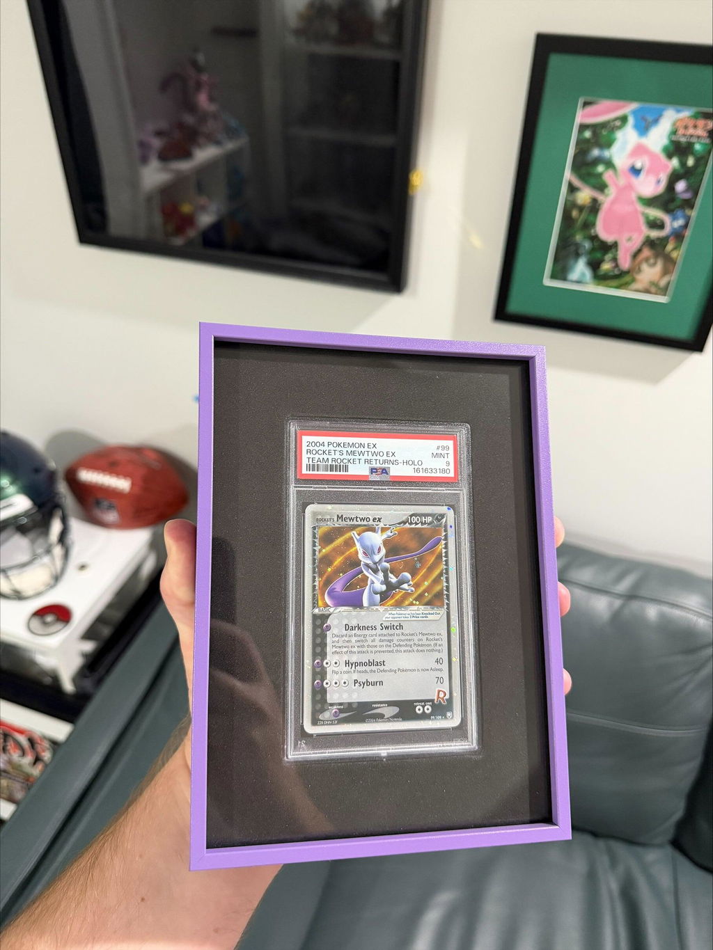
Whether you are displaying Pokémon cards, sports cards, graded slabs, One Touch holders or signed memorabilia, choosing the right surrounding colour can improve contrast, organisation and overall balance.
Why the Surrounding Colour Matters
The material around the cards acts as the visual foundation of the display.
It separates individual positions, creates contrast around the holders and influences how strongly the artwork stands out from the frame.
The right colour can:
- Improve contrast.
- Help card artwork stand out.
- Complement team or collection colours.
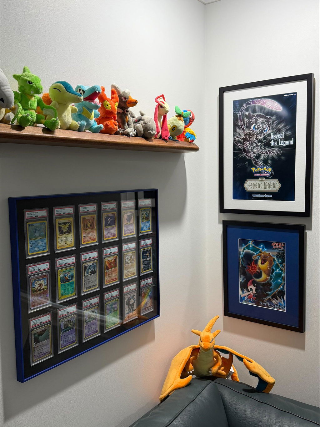
- Work with the surrounding room.
- Create a cleaner overall presentation.
The wrong colour can compete with the collection or make an already colourful display feel too busy.
Black EVA Foam
Black remains one of the most versatile choices for trading card displays.
Collectors often choose black because it:
- Creates strong contrast around clear holders and slab labels.
- Works with highly varied collections.
- Allows colourful card artwork to provide most of the visual interest.
- Pairs easily with dark, metallic and coloured aluminium finishes.
Black EVA is particularly useful for mixed graded-card collections, sports cards and TCG displays where the artwork already contains many different colours.
White EVA Foam
White EVA creates a brighter internal field and stronger separation between individual card positions.
It can work well when you want:
- A lighter overall display.
- Stronger definition between card positions.
- A clear contrast against darker frame finishes.
- A more open appearance on larger multi-card grids.
White EVA can be particularly effective with metallic or coloured aluminium finishes where the frame itself is intended to remain visible as part of the display.
Matching Pokémon Card Colours
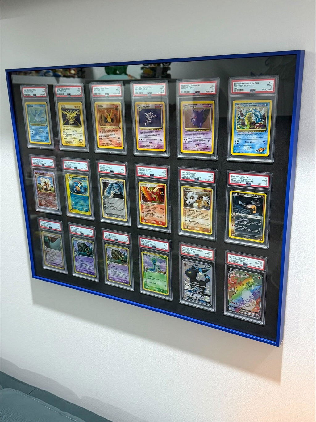
Pokémon collections often contain a wide mix of colours, so the surrounding insert does not need to match every card literally.
Black EVA can provide a neutral field around mixed artwork, while White EVA can create stronger separation between colourful cards and make the grid more obvious.
If the aluminium frame finish already introduces a strong colour, keeping the insert neutral can help prevent the overall display from becoming too busy.
Matching Sports Team Colours
Sports displays often include team colours, chrome finishes, refractors, autographs and patches, so the insert colour should usually support rather than duplicate every colour in the collection.
Black EVA can keep the background restrained around varied team colours, while White EVA can make the card positions feel more defined across a larger sports-card layout.
The aluminium frame finish can then be used separately if you want to introduce a team-related colour around the perimeter.
Using Neutral Colours
Neutral colours remain the safest choice for mixed collections because they are less likely to compete with the cards themselves.
For The Card Collective aluminium range, Black and White EVA provide two very different neutral directions:
- Black EVA creates a darker, more restrained internal field.
- White EVA creates a brighter field with stronger separation between positions.
Neither option is objectively better. The better choice depends on the frame finish, the cards and the room where the display will be installed.
Creating a Feature Display
If the goal is to make the display itself more noticeable, the frame finish can carry most of that colour while the EVA insert provides a consistent background around the holders.
For example, a coloured aluminium frame with Black EVA keeps the internal field controlled, while the same frame with White EVA creates much stronger contrast across the full grid.
This gives collectors a way to make the frame more expressive without needing to match every card individually.
Balancing Colour and Presentation
Colour works best when the display has a clear visual hierarchy.
If the cards are already highly varied, a restrained insert often makes the collection easier to read. If the cards are more uniform, stronger contrast between the frame and insert can make the overall grid more noticeable.
The aim is not to make every component stand out at once. The frame, insert and cards should work together rather than compete for attention.
Choosing the Right Colour for Your Collection
When choosing an insert colour, consider:
- The colours within the cards.
- The holder type and slab labels.
- The aluminium frame finish.
- The wall colour.
- The lighting in the room.
- Whether you want the grid to recede or remain clearly visible.
The best choice is usually the one that supports the collection while keeping the cards themselves easy to see.
Final Thoughts
The colour surrounding a trading card collection can have a surprisingly large effect on the finished display.
Black EVA creates a darker and more restrained background, while White EVA creates a brighter field with stronger separation between card positions.
Combined with the selected aluminium frame finish, the insert colour helps determine whether the display feels subtle, high-contrast, neutral or more visually expressive.
Continue Exploring
If you enjoyed this guide, you may also find these collector resources helpful.
📚 Collector Guides
-
The Ultimate Trading Card Display Guide: Ideas, Frames, Shelves & Display Solutions for Every Collector
Explore display ideas, wall layouts, shelving, cabinets, lighting, budgets and display solutions for every major trading card game. -
Why Premium Aluminium Trading Card Display Frames Are Worth It: The Complete Collector Guide
Discover why handmade aluminium display frames have become a premium choice for displaying PSA, CGC, BGS and One Touch trading card collections.
🛒 Shop Display Collections
-
Aluminium Trading Card Wall Display Frames
Premium handmade aluminium wall display frames for Pokémon, MTG, Yu-Gi-Oh!, One Piece and Sports Cards. -
PSA, CGC & BGS Graded Slab Wall Display Frames
Purpose-built wall display frames designed specifically for graded trading card collections. -
One Touch Wall Display Frames
Premium wall display frames designed for One Touch magnetic trading card holders in a range of grid sizes.

0 comments